How to Make Horizontal Accordion Menu with CSS
Accordion Menu provides a presentable interface for web site visitors to navigate through the content within a single page. This eliminates having to arrange multiple pages to display relevant contents on separate interface. You can built accordion menu to organize your contents grouping together the relevant contents over a single menu. Accordion menu features just like any tabs menu would displaying the content of particular menu. However, in accordion contents and menu are stacked together providing a beautiful design of hide and show effects. In this tutorial we will be building Horizontal Accordion menu with just HTML and pure CSS.
Now see there are lots of accordion designs that you could go for. And for that you can use several development approaches. For advanced features and broad applications use of Javascript or Jquery is an obvious choice, but in this tutorial we are keeping things simple and just restricting our development to pure HTML and CSS to built a horizonal accordion menu making effect use of the hover effect.
HTML and CSS Horizontal Accordion Menu With Example
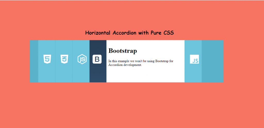
Lets understand a brief overview of what we are implementing. We will stack menu and content together side by side. Then by setting a minimum width just enough to show menu sections we will hide the content of the menu. Then with hover effect we will be increasing the width enough to display the content together with menu. Thats it. Seems easy ,right?? Okay! lets go on step by step.
Step 1: Building the Basic HTML Structure
Before building the HTML structure. first of all we will be linking CDN link of font-awesome to include some icons in our example. You can add icons from other sites like Google icons, iconicons, or wherever you prefer from. In this tutorial, I am going for font-awesome icons. So lets, add the following line in the
head section of your HTML.<link rel="stylesheet" href="https://cdnjs.cloudflare.com/ajax/libs/font-awesome/5.10.2/css/all.css">
With that done, lets start by building a basic structure of HTML.
<li class="accordion">
        <div class="icons">
          <i class='fab fa-html5'></i>
        </div>
        <div class="content">
          <h1>HTML</h1>
          <p>This is pure HTML and CSS Accordion Menu designed for your next project</p>
        </div>
      </li>
In the above structure, we have taken a list item and added some paragraph and icon from font awesome. The code should be self-explanatory even to beginners.
Complete Horizontal Accordion Menu HTML
With above basic structure understood. Other elements are just redundant multiplication of the above basic example. So below is the final complete HTML. The icons will be used for menu while content will be its relevant content which will be displayed when hovered over the icon.
<h2>Horizontal Accordion with Pure CSS</h2>

    <ul class="accordion_menus">
      <li class="accordion">
        <div class="icons">
          <i class='fab fa-html5'></i>
        </div>
        <div class="content">
          <h1>HTML</h1>
          <p>This is pure HTML and CSS Accordion Menu designed for your next project</p>
        </div>
      </li>

      <li class="accordion">
        <div class="icons">
           <i class="fab fa-css3-alt"></i>
        </div>
        <div class="content">
          <h1>CSS</h1>
          <p>This is pure css Accordion  design using HTML and CSS only</p>
        </div>
      </li>

      <li class="accordion">
        <div class="icons">
           <i class='fab fa-node-js'></i>
        </div>
        <div class="content">
          <h1>Node.js</h1>
          <p>This is pure HTML CSS designed Horizontal Accordion Menu</p>
        </div>
      </li>

      <li class="accordion">
        <div class="icons">
           <i class='fab fa-bootstrap'></i>
        </div>
        <div class="content">
          <h1>Bootstrap</h1>
          <p>In this example we won't be using Bootstrap for Accordion development. </p>
        </div>
      </li>

      <li class="accordion">
        <div class="icons">
           <i class='fab fa-js'></i>
        </div>
        <div class="content">
          <h1>JavaScript</h1>
          <p>In this tutorial we are designing Horizontal Accordion for website without JavaScript.  </p>
        </div>
      </li>
    </ul>
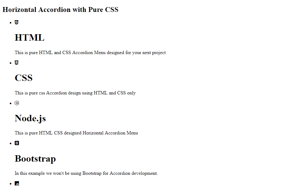
The above complete HTML should render the following web structure.

Step 2: Adding Basic CSS
Okay! Seems fair enough. We haven’t added any CSS so the mere HTML looks nothing like horizontal accordion menu. So yeah, from here on its all experiments.
body{
  background: #f77462;

}
h2
{
  font-family: 'Saira Stencil One', cursive;
  text-align:center;
  margin-top:10%;
  margin-top:8%;
  margin-bottom:4%;
}
The above CSS adds background to the page and arranges the heading to a proper position with better font styling.
Step 3: Horizontal Accordion Menu Stacking
.accordion_menus{
  margin-left:15%;
  background: #5ab2ca;
  width: 65%;
  min-width: 800px;
  overflow: hidden;
  height: 200px;
  font-size: 0;
}
.accordion{
  display: inline-block;
  background-color: #6dc5dd;
  border-right: #5ab2ca 1px solid;
  width: 80px;
  overflow: hidden;
  position: relative;
  margin: 0;
  font-size: 16px;
  transition: all 0.4s ease-in-out 0.1s;
}
As already mentioned for horizontal accordion menu, we will be manipulating the CSS property
width of the content and menu to provide an interactive show and hide property. Since the width contains the overall content, I have pre-estimated our final content width and set the min-width of the accordion_menus element. With that set, the value of width that is 65% never yields a width less than 800px in any responsiveness. That is set because if the width of the horizontal accordion menu is less than the estimated width then some width jitter occurs. Try experimenting.
Then the
width of the accordion element was set to 80px for now which isn’t enough to showcase the entire content but is wide enough to display the menu content. We will be increasing the size of width as we over over the menu just as we did for vertical accordion menu.
For now the content and menu gets stacked together if you view your web page.
Step 4: Separating each Accordion Menu Stacks
Okay! Coming to these point we have managed to set a minimum width of the accordion menu that further sets out to be a horizontal accordion menu. Now we want to increase the width of the menu as the icon is hovered on. So here we have it the hover effect.
.accordion:hover{
   width: 450px;
}
Above CSS simply expands the width of the
accordion. However still the contents seem to stack. We need to arrange the icon element and content element separately. Now by separation don’t get misled by tabs menu configuration where all menus are arranged together either horizontally or vertically depending upon the designs while contents are arranged together separately. While in accordion we are spearting the menu and content stack but they will be relatively positioned against each other. So, lets manipulate the content element CSS..accordion .content {
position: relative;
width: 360px;
margin-left: 80px;
padding: 10px 0 0 10px;
height: 200px;
background: #fff;
}
With above code, we successfully separated the content with menu just by adding a
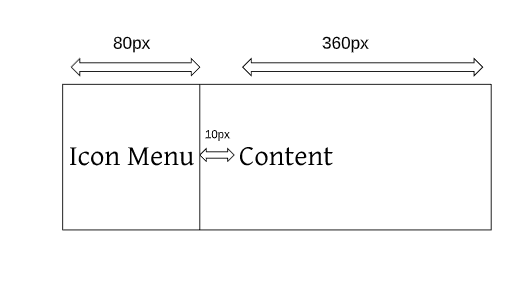
margin-left of appropriate value such that the width of the icon menu i.e. 80px + width of content i.e.360px + padding-left i.e. 10px would finally add up giving the width of 450px as set by the hover effect. This content and menu separation with width manipulation can be further depicted by following figure.
Step 5: Beautifying the Accordion Menu
It seems though, we have achieved the basic expand and collapse feature of the horizontal Accordion Menu with pure CSS coming to this point of tutorial. But the menu lacks a beautiful design, So lets experiment with designs.
.fab{
font-size: 3em;
color:white;
display: block;
line-height: 0;
}
The above CSS designs the icon’s specifications. The
font-size is used to increase the size of the icon..fab:before, .fab:after {
transition: all 0.4s ease-in-out 0.1s;
position: absolute;
padding-top: 90px;
padding-left: 25px;
}
.fab:after{
padding-left: 20px;
margin-left: 85px;
width:100%;
height:100%;
background-size: 100%;
background-image: linear-gradient(#283e56, #325372);
}
The above CSS seems pretty confusing to look at. But the
::before selector adds contents before the fab element while ::after selector adds content after the fab element. These additions will be needed for transitions. For now you can simply look at the CSS of ::before selector which simply sets the padding and positioning of the fab element. The ::before can be assumed as the positioning arrangment of the icon currently seen. Those are just a mere experimentation with pixels to align the icon centrally to our menu display.
Note: The use of content
property in ::before and ::after selector is very important as it sets out what needs to be added to the selected elements before and after itself.Step 6: Adding the “::after” Element
In the above CSS we have added :after CSS and set its positioning and padding. But we haven’t added any content. So now lets add the contents.
.fa-html5:after{
color:yellow;
content:'\f13b';
}
.fa-css3-alt:after{
color:#47B0F9;
content:'\f38b';
}
.fa-js:after{
background-color:black;
color:white;
content:'\f3b8';
}
.fa-bootstrap:after{
content:'\f836';
}
.fa-node-js:after{
color:#83CD29;
content:'\f3d3';
}
In step 5, we added CSS for
fabs class as they were common for all icons. But since each icons are different from one another for each item we have added individual unicode content resembling to the corresponding icon. The unicode was obtained from official font-awesome site. Since we haven’t set any content for ::before, its because the icon provided from the html structure serves its purpose.Step 7: Transition Effect on Accordion Menu
.accordion:hover .fab:before {
margin-left: -100px;
}
.accordion:hover .fab:after {
margin-left: -5px;
}
Now Since we’ve added
::after contents for each different icons. The above CSS simply replaces the display of ::before content with ::after contents. By moving to way left the original content and moving the ::after content left till it is visible to display.
Complete Horizontal Accordion Menu CSS
If you have just scrolled down then for complete HTML portion, please look in step-1. The complete Horizontal Accordion Menu CSS for this tutorial is given below. You can just copy the HTML and CSS and that should work fine.
body{
background: #f77462;
}
h2
{
font-family: 'Saira Stencil One', cursive;
text-align:center;
margin-top:10%;
}
.accordion_menus{
margin-left:15%;
background: #5ab2ca;
width: 65%;
min-width: 800px;
overflow: hidden;
height: 200px;
font-size: 0;
}
.accordion{
display: inline-block;
background-color: #6dc5dd;
border-right: #5ab2ca 1px solid;
width: 80px;
overflow: hidden;
position: relative;
margin: 0;
font-size: 16px;
transition: all 0.4s ease-in-out 0.1s;
}
.accordion:hover{
width: 450px;
}
.fab{
font-size: 3em;
color:white;
display: block;
line-height: 0;
}
.accordion .content {
  position: relative;
  width: 360px;
  margin-left: 80px;
  padding: 10px 0 0 10px;
  height: 200px;
  background: #fff;
}
.fab:before, .fab:after {
  transition: all 0.4s ease-in-out 0.1s;
  position: absolute;
  padding-top: 90px;
  padding-left: 25px;

}
.fab:after{
  padding-left: 20px;
  margin-left: 85px;
  width:100%;
  height:100%;
  background-size: 100%;
  background-image: linear-gradient(#283e56, #325372);
}
.fa-html5:after{
  color:yellow;
  content:'\f13b';

}
.fa-css3-alt:after{
  color:#47B0F9;
  content:'\f38b';
}
.fa-js:after{
  background-color:black;
  color:white;
  content:'\f3b8';
}
.fa-bootstrap:after{
  content:'\f836';
}
.fa-node-js:after{
  color:#83CD29;
  content:'\f3d3';
}
.accordion:hover .fab:before {
  margin-left: -100px;
}
.accordion:hover .fab:after {
  margin-left: -5px;
}
Conclusion
Accordion Menu system provides an interactive approach to organizing your contents. In this tutorial we have used pure HTML and CSS to build a beautiful example of horizontal accordion menu. From here, you could go on exploring further designs of accordion and development process. Though using CSS seem a basic simple implementation in major development fields, the use of JavaScript or jquery is recommended. Well, congrats you held through. That’s it for now!!


Wow! What a beautiful list of information. Too much. A good thing is how much I’ve learned from this. It’s that good!. Could you share your review on! top 5 web design trends in 2020
ReplyDelete